-
[CSS]css 레이아웃(1) - position / float프로그래밍/HTML&CSS 2021. 12. 24. 12:32
앞서 CSS의 박스 모델에 대해 알아보았다.
오늘은 그 박스들을 배치해 레이아웃하는 법을 알아보고자 한다.[CSS]css 박스 모델
오늘은 CSS 기본 설정 중 하나인 박스 모델에 대해 알아보고자 한다. HTML 콘텐츠는 다음과 같이 구성되어있다. - 높이(height) - 너비(width) - 패딩(padding) - 테두리(border) - 여백(margin) 웹페이지에서.
hyemco.tistory.com
css의 레이아웃 방법에는 여러 방법이있다.
1. positon
2. float
3. table
4. flexbox
5. grid
1~3은 css 초기 방식으로 레이아웃을 위해서는 잘 쓰이지 않고, 4, 5가 주로 쓰이고 있다.
이 포스팅은 그냥 이런 태그들이 있구나!하고 가볍게 이해하는 수준의 포스팅이니 참고하길 바란다.※소스코드는 설명에 필요한 부분만 적혀있습니다. 전체 소스코드는 본문 아랫부분에 있으니 참고하세요
1. position
position의 속성값은 5가지가 있다.
가장 중요한 차이점은 어디를 기준 삼아 item을 위치시키는가이다.
1) static : positon의 defalut 값
2) relative : 원래 위치에서 아이템을 이동시킨다..item2 { position: relative; left: 40px; top: 40px; }
3) absolute : 본인이 정한 기준점을 기준으로 이동
- 마치 공중에 떠있는 것처럼 이동하므로 근처의 아이템이 그 자리를 차지한다.
(item들을 묶어둔 .box를 기준점 삼았다).item2 { position: absolute; left: 40px; top: 40px; }
※ relative와 absolute 비교왼쪽) item2, item3 둘다 absolute
오른쪽) item2:absolute / item3:relative
왼쪽은 item2/3 모두 absolute라 공중에 띄어진 것처럼 이동하고, item4가 자리를 채웠지만,
오른쪽은 item2는 absolute로 공중에 띄어져 이동, 그자리를 채운 item3은 relative라 item2와 다른 기준점에서 이동한 것을 볼 수 있다.<!-- 왼쪽 이미지 --> .item2 { position: absolute; left: 40px; top: 40px; } .item3 { position: absolute; left: 20px; top: 20px; } <!-- 오른쪽 이미지 --> .item2 { position: absolute; left: 40px; top: 40px; } .item3 { position: relative; left: 20px; top: 20px; }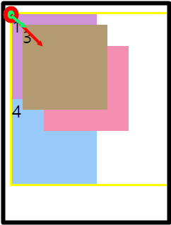

4) fixed : viewport를 기준으로 이동
- absolute와 유사하나 스크롤링해도 아이템이 그 자리를 유지한다..item2 { position: fixed; left: 40px; top: 40px; }5) sticky : 스크롤링 중 화면상 그 자리를 유지
- 처음에는 left값만 relative처럼 유지
- 스크롤링 하면서 설정한 한계점이 오면 설정한 top, left 위치에서 fixed처럼 고정.item2 { position: sticky; left: 40px; top: 40px; }
※sticky는 지원되는 않는 브라우저가 꽤 있으므로 브라우저에 따라 확인해보고 사용하길 바란다.2. float
한 요소 주위에 inline 요소가 좌우측에 배치되는 것을 설정하는 속성
1) float: none;
2) float:left;
3) float:right;
※ float는 레이아웃 방법 중 하나로 소개했지만, 원래는 사진/동영상과 글과의 정렬을 위해 만들어진 태그였다.
지금은 flexbox, grid와 같이 레이아웃에 더 적합한 태그들이 나오면서 본래 목적으로서 쓰이는 경우가 많으니 이런 태그가 있구나~하는 정도로만 생각해주면 좋겠다.요약
1. position
1) static : default
2) relative : 기존의 자리가 기준점
3) absolute : 지정한 태그(부모태그)가 기준점
4) fixed : viewport가 기준점 / 스크롤링 때 자리 유지
5) sticky : relative를 유지하다 한계점에서 지정한 위치 유지2. float
1) none : default
2) left : 지정요소가 왼쪽에 위치
3) right : 지정요소가 오른쪽에 위치전체 소스코드
1. position
<!DOCTYPE html>
<html lang="ko" dir="ltr">
<head>
   <meta charset="utf-8">

   <style>
      .box {
         hetight: 100vh;
         border: 2px solid yellow;
      }

      .item {
         width: 80px;
         height: 80px;
      }

      .item1 {
         background: #ce93d8;
      }

      .item2 {
         background: #f48fb1;
         position: static; /*relative absolute fixed sticky*/
         left: 40px;
         top: 40px;
      }

      .item3 {
         background: #b39a71;
      }

      .item4 {
         background: #98caf9;
      }
   </style>

   <title></title>
</head>

<body>
   <div class="box">
      <div class="item item1">1</div>
      <div class="item item2">2</div>
      <div class="item item3">3</div>
      <div class="item item4">4</div>
   </div>
</body>
</html>
2. float
<!DOCTYPE html> <html lang="ko" dir="ltr"> <head> <meta charset="utf-8"> <style> img { float: none; /*left right*/ } </style> <title></title> </head> <body> <img src="남산.jpg" width="500px" height="250px"> <p>남산 설명 내용</p> </body> </html>'프로그래밍 > HTML&CSS' 카테고리의 다른 글
[CSS]css 레이아웃(3)- flexbox (0) 2021.12.27 [CSS]css 레이아웃(2)- flexbox (0) 2021.12.25 [CSS]css 태그 - div / span (0) 2021.12.23 [CSS]css display 속성 - block, inline, block-inline (0) 2021.12.22 [CSS]css 박스 모델 (0) 2021.12.21
